Students can Download Economics Chapter 4 Presentation of Data Questions and Answers, Notes Pdf, 1st PUC Economics Question Bank with Answers helps you to revise the complete Karnataka State Board Syllabus and score more marks in your examinations.
Karnataka 1st PUC Economics Question Bank Chapter 4 Presentation of Data
1st PUC Economics Presentation of Data TextBook Questions and Answers
Question 1.
Bar diagram is a
(a) One – dimensional diagram
(b) two – dimensional diagram
(c) diagram with no dimension
(d) None of the above
Answer:
(a) One – dimensional diagram
Question 2.
Data represented through a histogram can help in finding graphically the:
(a) mode
(b)mean
(c) median
(d) None of the above
Answer:
(a) mode
Question 3.
O gives can be helpful in locating graphically the
(a) mode
(b) mean
(c) median
(d) all the above
Answer:
(c) median
![]()
Question 4.
Data represented through arithmetic line graph help in understanding:
(a) long term trend
(b) seasonality in data
(c) cylicity in data
(d) all the above
Answer:
(a) long term trend
Question 5.
Width of bars in a bar diagram need not be equal (True/False)?
Answer:
False
Question 6.
Width of rectangles in a histogram should essentially be equal (True / False)?
Answer:
False
Question 7.
Histogram can only be formed with continuous classification of data? (True / False)?
Answer:
True.
![]()
Question 8.
Histogram and column diagram are the same method of presentation of data? (True/False)?
Answer:
True.
Question 9.
Mode of a frequency distribution can be known graphically with the help of histogram. (True / False)?
Answer:
True.
Question 10.
Median of a frequency distribution cannot be known from the O gives. (True / False).
Answer:
False.
Question 11.
What kind of diagrams are more effective in representing the following :
- Montly rainfall in year
- Composition of the population of delhi by religion
- Components of cost in a factory
Answer:
- Bar diagram
- Sub – divided or Component Bar Diagram
- Component Bar Diagram.
![]()
Question 12.
Suppose you want to emphasise the increase in the share of urban non – workers and lower level of urbanisation in India. How would you do it in the tabular form?
Answer:
Increase in the share of urban non – workers:
| Years | No.of Urban non – workers (in Percentage) |
| 2001 | 20 |
| 2002 | 22 |
| 2003 | 20.4 |
| 2004 | 21 |
| 2005 | 22.3 |
| 2006 | 21.5 |
(Note: Arbitary figures have been taken)
Question 13.
How does the procedure of drawing a histogram differ when class intervals are unequal in comparison to equal class intervals in a frequency table?
Answer:
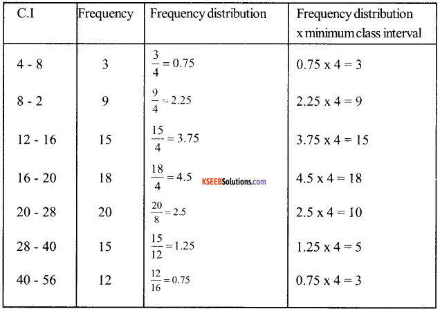
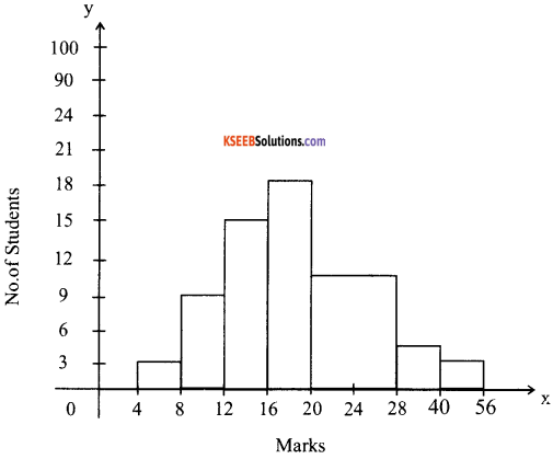
When the class intervals are equal, then by normal method we can make histogram which has equal width of rectangle. When the class intervals are unequal, heights of rectangles are to be adjusted to yield comparable measurements by using frequency density (Class frequency divided by width of the class interval) instead of absolute frequency.
Question 14.
The Indian Sugar Mills Association reported that ‘Sugar production during the first fortnight of December 2001 was about 3,87,000 tonnes, as against 3,78,000 tonnes during the same fortnight last year (2000). The off-take of sugar from factories during the first fortnight of december 2001 was 2,83,000 tonnes for internal consumption and 41,000 tonnes for exports as against 1,54,000 tonnes for internal consumption and nill for exports during the same fortnight last season.
- Present the data in tabular form.
- Suppose you were to present these data in diagrammatic form which of the diagrams would you use and why?
- Present these data diagrammatically
Answer:
1.

2. To present these data in diagramatic form we can use multiple bar diagram because these are effective in comparing two or more sets of data.
3.
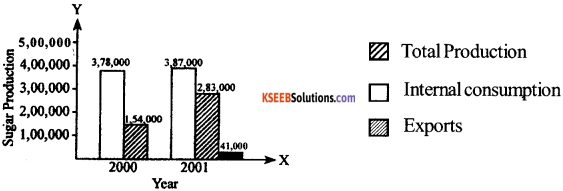
![]()
Question 15.
The following table shows the estimated sectoral real growth rates (percentage change over the previous year)
Answer:
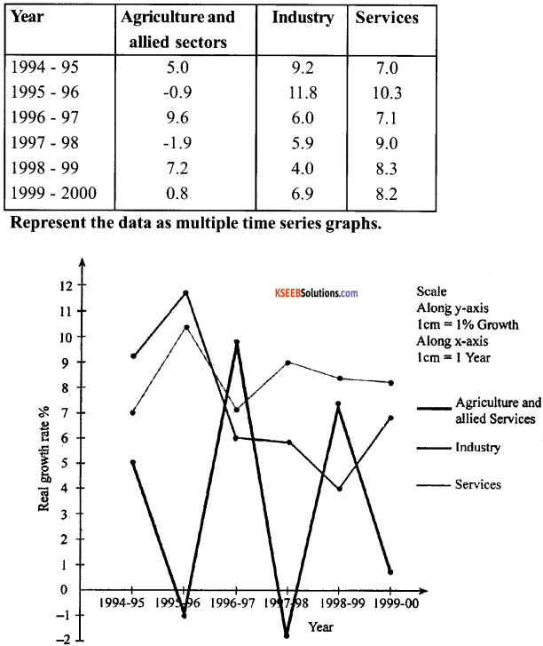
1st PUC Economics Presentation of Data Additional Questions and Answers
1st PUC Economics Presentation of Data Very Short Answer Type Questions
Question 1.
What is meant by presentation of data?
Answer:
Presentation of data means exhibition of the data in a clear and attractive manner.
Question 2.
What is a table? or tabulation?
Answer:
A table is a systematic organisation of data in columns and rows.
Question 3.
What are the kinds of tables?
Answer:
The different kinds of tables are:
- General purpose table
- Special purpose table
- Original table
- Derived table
- Simple or one way table
- Complex table.
![]()
Question 4.
What are the two principal components of table?
Answer:
The principal components of table are:
- Table number
- Title and Head note
Question 5.
What is meant by bar diagram?
Answer:
When the data is represented with the help of vertical or horizontal rectangular bars then it is called as bar diagram.
Question 6.
What is a pie diagram?
Answer:
The circular representation of data is called as pie diagram.
Question 7.
What are the frequency diagram?
Answer:
Frequency diagrams are those diagram which present frequency distribution diagramatically.
Question 8.
What is a frequency curve?
Answer:
A frequency curve is a curve which is plotted by joining the midpoints of all tops of a histogram by free hand smoothed curves.
Question 9.
What are time series graphs?
OR
What are arithmetic line graphs?
Answer:
Graphs showing arithmetic values of variables are called as time-series graphs.
![]()
Question 10.
State two limitations of graphic representation of time series data.
Answer:
The major two limitations of graphic presentation of time series data:
- Very limited use
- Easily can be misused.
Question 11.
Give the types of classification?
Answer:
The different types of classification are:
- Quantitative classification
- Qaulitative classification
- Spatial classification
- Temporal classification
Question 12.
What is quantitative classification?
Answer:
When the data is classified on the basis of weight, height, Kgs etc can be called as Quantitative classification.
Question 13.
Define chronological classification?
Answer:
When the data are classified on the basis of time is known as chronogical classification. Eg : hour, day, week, months, years etc.
Question 14.
Explain geographical classification?
Answer:
When the data is classified on the basis of place than it can be called as geographical classification or spatial classification.
![]()
Question 15.
What is qualitative classification?
Answer:
When the data is classified on the basis of quality or attribute such as sex, literacy, beauty, honesty, education etc. than it is known as qualitative classification.
Question 16.
Give two advantages of tabulation?
Answer:
Advantages of tabulation are as follows:
- The tabulated can be easily understood.
- The data becomes attractive and leaves a lasting impression.
Question 17.
Give two advantages of diagramatic representation of data?
Answer:
Advantages of diagramatic representation of data:
- Diagrams give a very clear picture of data.
- Diagramatic representation makes easy to differentiate data from one information to another information.
Question 18.
Give two limitations of diagramatic presentation?
Answer:
Limitations of diagramatic representation:
- A limited set of data can be presented in the form of a diagram.
- Diagram does not present the small differences properly.
1st PUC Economics Presentation of Data Short Answer Type Questions
Question 1.
Give an example of qualitative classification?
Answer:
Example of qualitative classification:
Literacy in Bihar (in percentage)
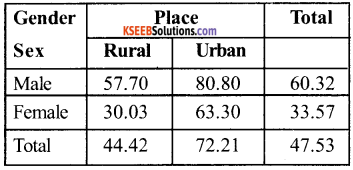
![]()
Question 2.
Draw less than cumulative frequency curve with the help of the following frequency distribution?
| Marks in Maths | No. of Students |
| 0-20 | 6 |
| 20-40 | 5 |
| 40-60 | 33 |
| 60-80 | 14 |
| 80 – 100 | 6 |
| Total | 64 |
Answer:
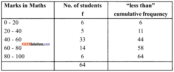
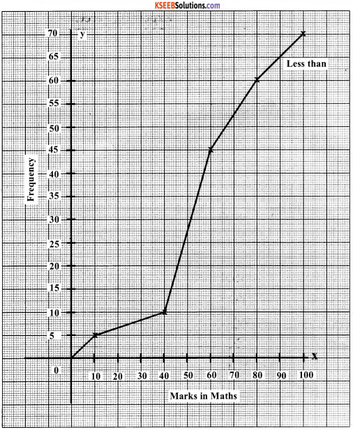
Question 3.
Give an example of qualitative classification?
Answer:
Example of quantitative classification:
| Age in year 2001 | No. of Students |
| 0-5 | 10 |
| 5-10 | 120 |
| 10-15 | 140 |
| 15-20 | 30 |
| Total | 300 |
![]()
Question 4.
Prepare a table showing spatial classification
Example of spatial classification:
Exports by India to other countries in a particular
| Country | Export (in Percentage) |
| 1. America | 21.8 |
| 2. U.K | 5.7 |
| 3. Japan | 4.9 |
| 4. Russia | 2.1 |
| 5. Asia | 19.0 |
| 6. OPEC | 10.5 |
| 7. Germany | 5.6 |
| 8. Other European Countries | 14.7 |
| 9. Other Eastern European Countries | 0.6 |
| 10. Other underdeveloped countries | 5.6 |
| 11. Others | 9.5 |
| 100.0 |
| Country | Exports (in Crores) |
| Japan | 500 |
| Germany | 400 |
| America | 700 |
Question 5.
Give an example of the spatial classification?
Answer:
Example of Spatial classification:
Exports by India to other countries
![]()
Question 6.
Give the purposes of classification.
Answer:
Following are the objectives (purposes) of classification:
- To condense the mass of data in such a manner that similarities and disimilarities are readily apprenended and relationships studies.
- To facilitate comparisons.
- To have a bird’s eye – view of the significant feature of the data.
- To enlight important information while giving less prominence to insignificant items.
- To utilise the data for tabulation and further statiscal analysis.
- To eliminate unnecessary details contained in the raw data.
- To present the complex, scattered in a concise, logical and understable form.
Question 7.
Draw a simple bar diagram to show the following figures relating to manufacturing of fans.

Answer:
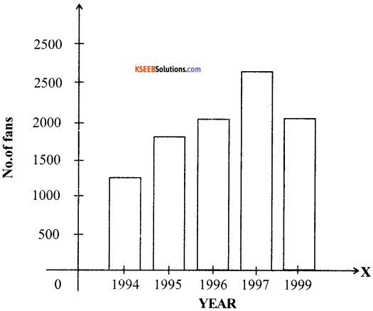
Question 8.
The following table gives the result of B.Com, students of a college for four years.
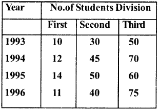
Answer:
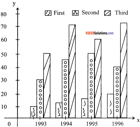
![]()
Question 9.
Give steps in the preparation of pie – diagram.
Answer:
Following are the steps involved in the preparation of pie – diagram.
- Convert each component as a percentage of the total.
- Multiply the percentage by \(\frac{360^{\circ}}{100}\)= 3.6 + 0 convert into degrees.
- Starting with the twelve ‘O’ clock position on the circle (clockwise) draw the large component circle.
- Draw other components in clockwise succession in descending order of magnitude except for each -all components like all others and miscellaneous which are shown last.
- Use different columns or shades to distinguish between different components.
- Explain briefly the different components either within the components in the figure or outside by arrows.
Question 10.
Show the following data by means of a suitable diagram.
Answer:
Production of Tea, cocoa, coffee
Tea Coca Coffee | 3260 tons 1850 tons 900 tons |
| Total | 6010 tons |
Answer:
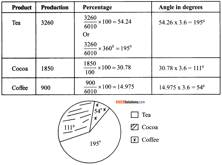
1st PUC Economics Presentation of Data Long Answer Type Questions
Question 1.
Represent the following in double line graph
Production in tons
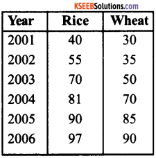
Answer:
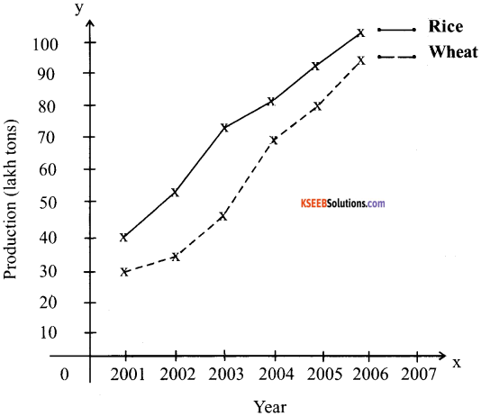
![]()
Question 2.
Give an example of discrete frequency distribution?
Answer:
The formation of discrete frequency distribution is quite simple. The number of items a particular value is repeated is noted down and mentioned against that values instead of writing that value repeatedly. Eg : In the distribution 3,4,6, 6, 8, 8, 8, 8,1, 1, 1, we can write :
| Value | Frequency |
| 3 | 1 |
| 4 | 1 |
| 6 | 2 |
| 8 | 3 |
| 1 | 3 |
Question 3.
How classes can be formed while presenting the data?
Answer:
Classes can be formed in two ways:
- Exclusive type
- Inclusive type
1. Exclusive type:
When the class intervals are so fixed that the upper limit of one class is the lower limit of the new class, it is known as the exclusive method of classification.
Example:
| Marks (Percentage) | No. of. Students |
| 0- 10 | 15 |
| 10-20 | 17 |
| 20-30 | 22 |
| 30-40 | 30 |
| 40-50 | 39 |
2. Inclusive Type:
Under this method the upper class limit of the frequency class will not become the lower limit of next class. This type of classification is called as Inclusive type.
| Marks (percentage) | No. of. Students |
| 0-9 | 5 |
| 10-19 | 8 |
| 20-29 | 7 |
| 30-39 | 10 |
| 40-49 | 12 |
Draw a histogram with the above data?
This is a case of unequal class intervals
![]()
Question 4.
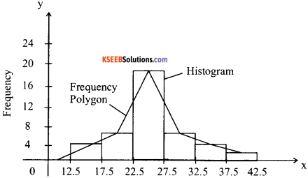
Draw a histogram and a frequency polygon from the following frequency distribution table of marks in English
| Class boundaries | Frequency |
| 12.5 – 17.5 | 3 |
| 17.5-22.5 | 6 |
| 22.5 -27.5 | 19 |
| 27.5 – 32.5 | 6 |
| 32.5 – 37.5 | 3 |
| 37.5 -42.5 | 1 |
Answer:
